An Identity of Reverence
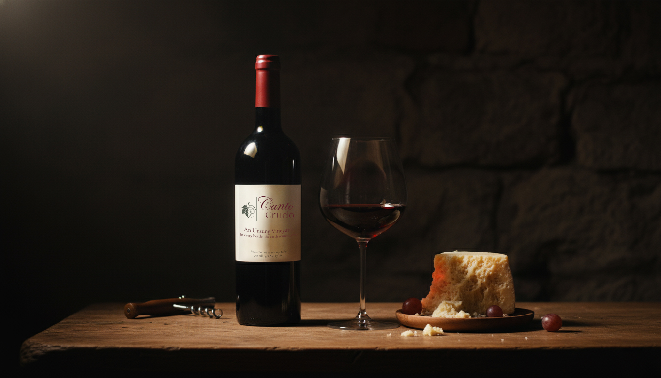
What emerged was a brand identity that feels less designed and more unearthed. The logo, a hand-drawn script, carries the cadence of a song half-sung. The palette whispers of warmth, wisdom, and restraint.
There are places where time does not move forward it deepens. Canto Crudo is born in one such place.
At Yasha Creatives, we approached Canto Crudo not as a wine brand, but as a hymn. Its essence was too honest for ornament, too soulful for spectacle.
We listened to the rhythm of the land, to the patient heartbeat of the vintner, to the poetry written in dust and grape.


What emerged was a brand identity that feels less designed and more unearthed. The logo, a hand-drawn script, carries the cadence of a song half-sung. The palette whispers of warmth, wisdom, and restraint.

Canto Crudo is proof that true refinement needs no noise — only presence, authenticity, and soul. It does not shout luxury; it murmurs it, like a prayer.